FIRST DIRECTION
Bold beans. Bigger attitude. Brewed for people who don't do boring mornings.
CREATIVE DIRECTION
BRANDING
PACKAGING
ART DIRECTION
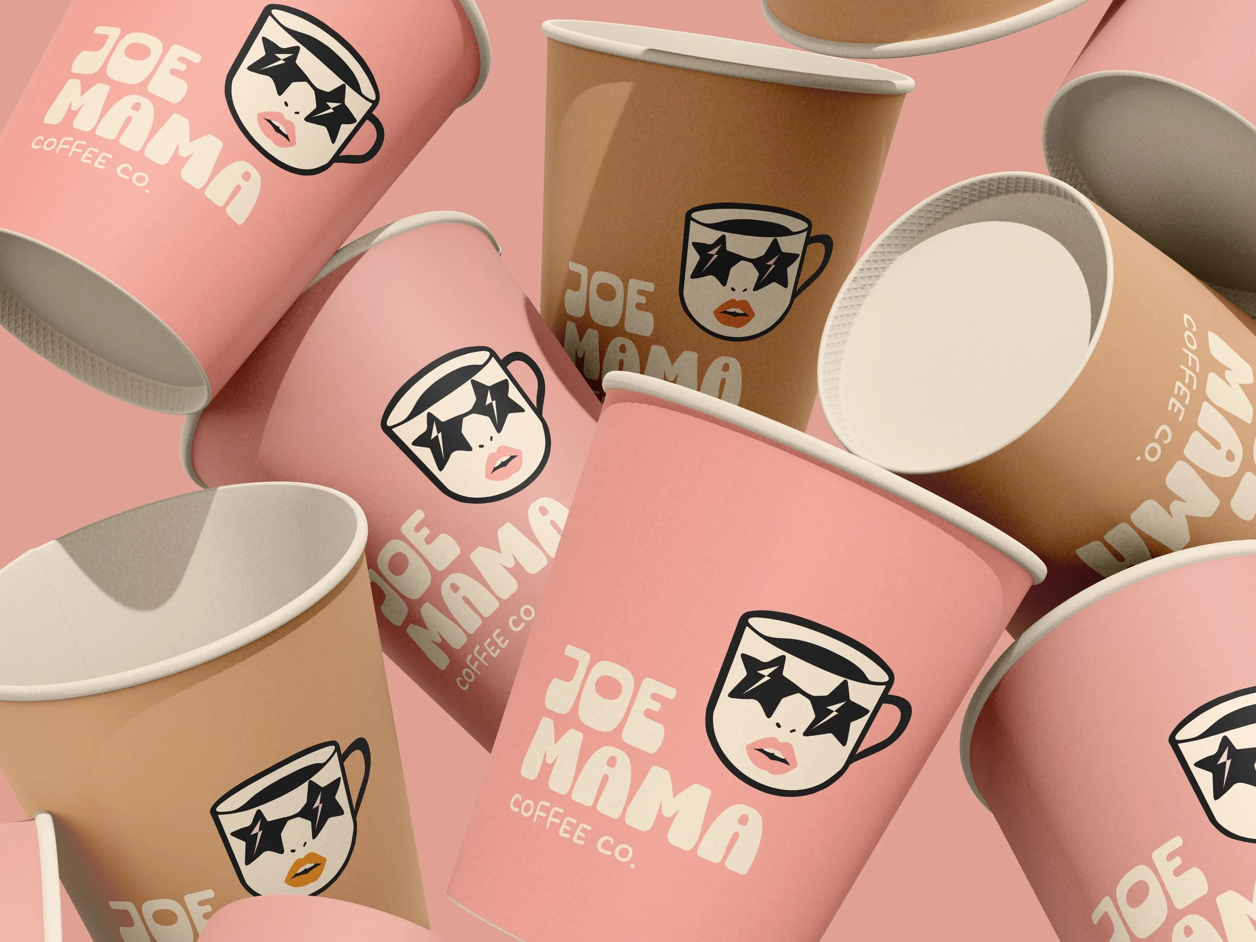
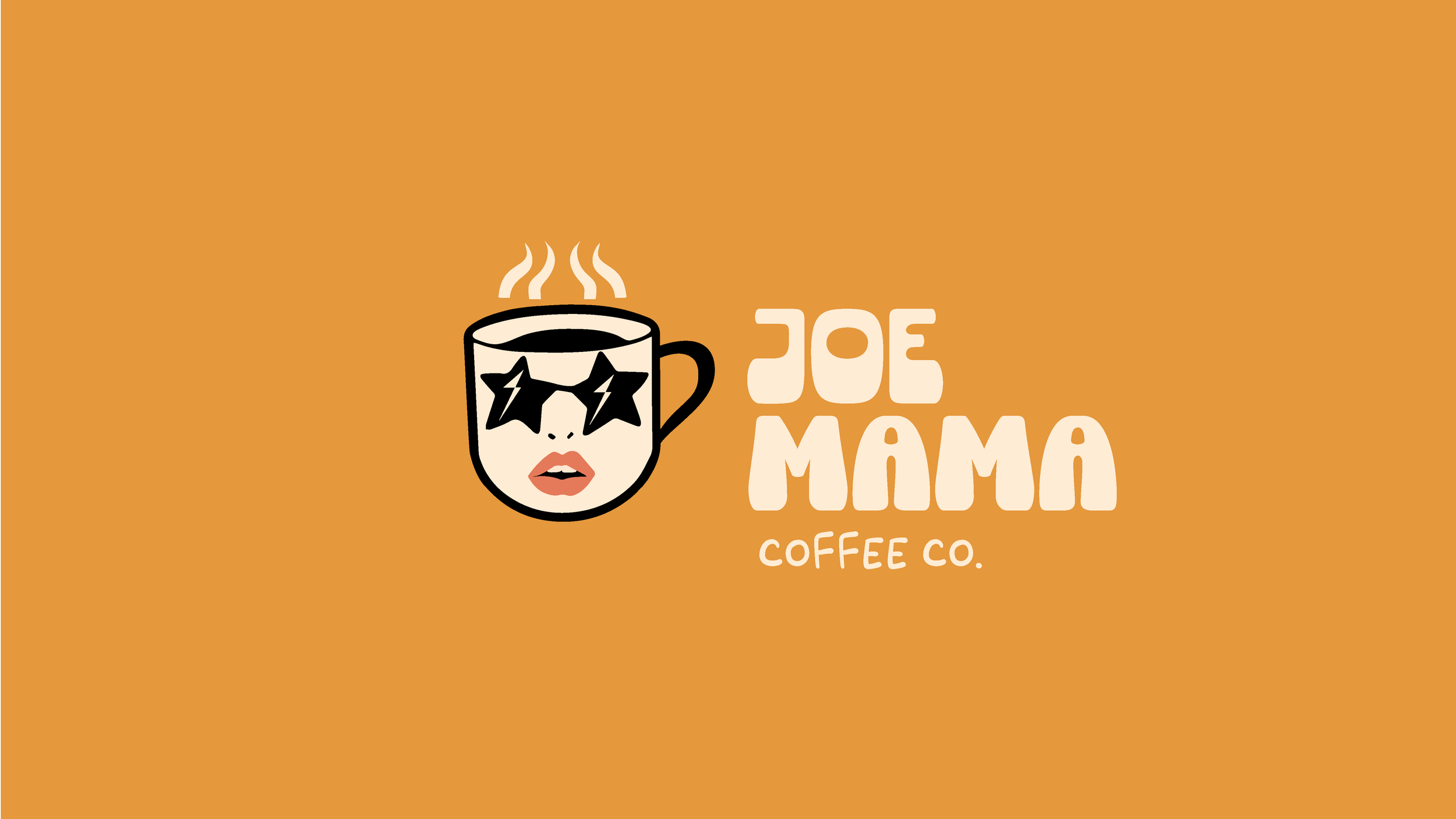
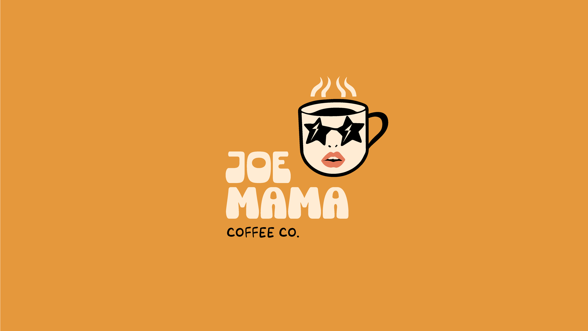
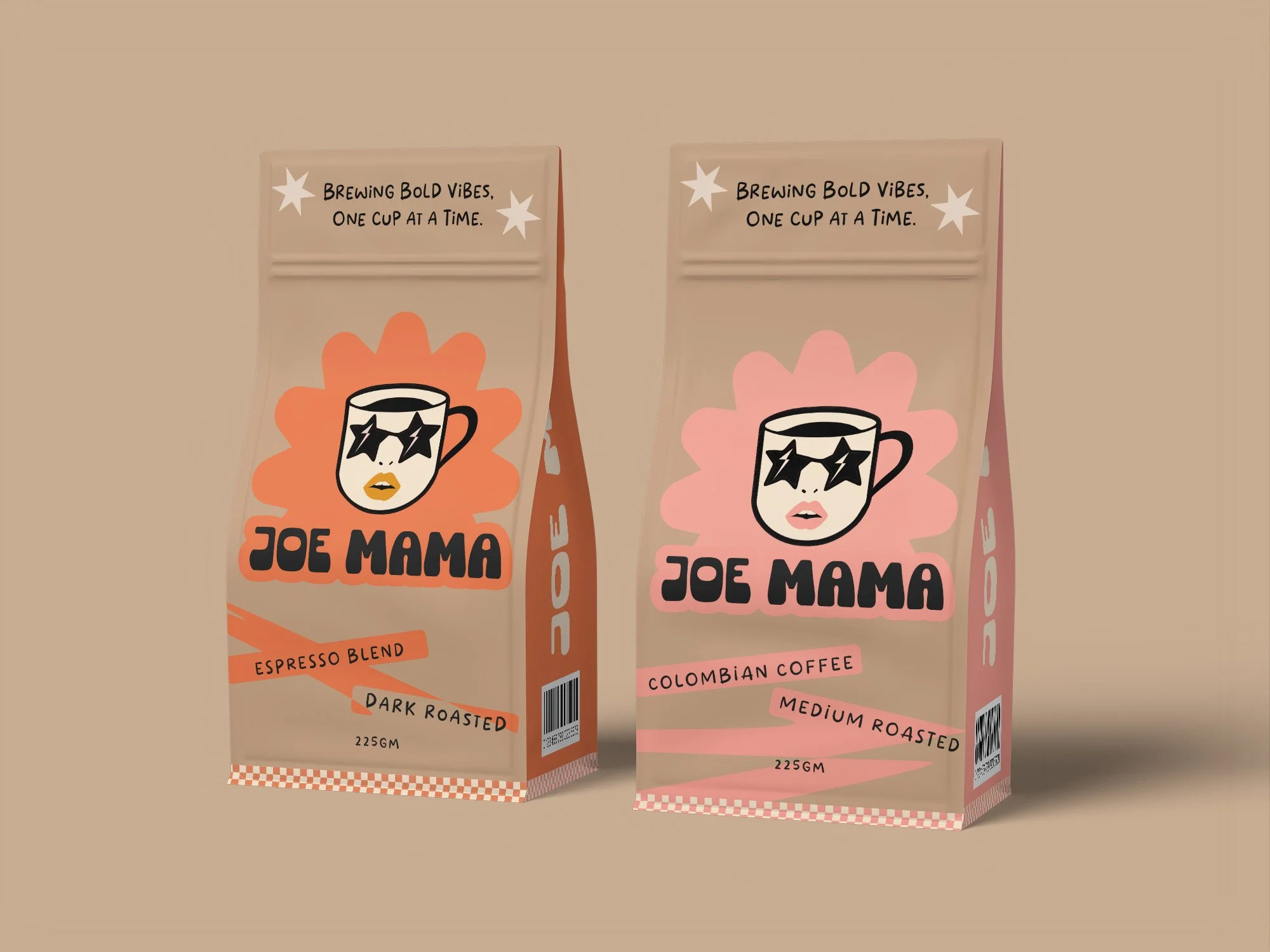
Joe Mama doesn't do quiet mornings. Born from 70s glam energy — star-shaded shades, painted lips, steam like stage smoke — every cup is an entrance, not a routine.
We keep the swagger loud and the beans honest: real sourcing, real roasting, whether you're reaching for our bold Espresso Blend or the smoother Colombian medium roast.
Joe Mama isn't your ritual. She's the friend who shows up loud, pours you a cup, and turns a random Tuesday into a good story.

Color Palette
Pattern


SECOND DIRECTION
Slow mornings. Warm mugs. Good people.
CREATIVE DIRECTION
BRANDING
PACKAGING
ART DIRECTION
Before coffee was a flex, it was a gathering place. A checkered counter, a warm mug passed between old friends, a jukebox humming something soft in the background. That's the world Joe Mama lives in.
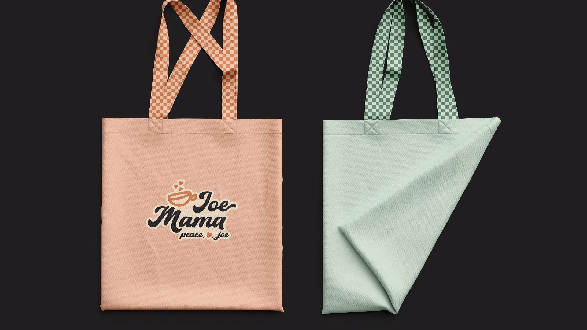
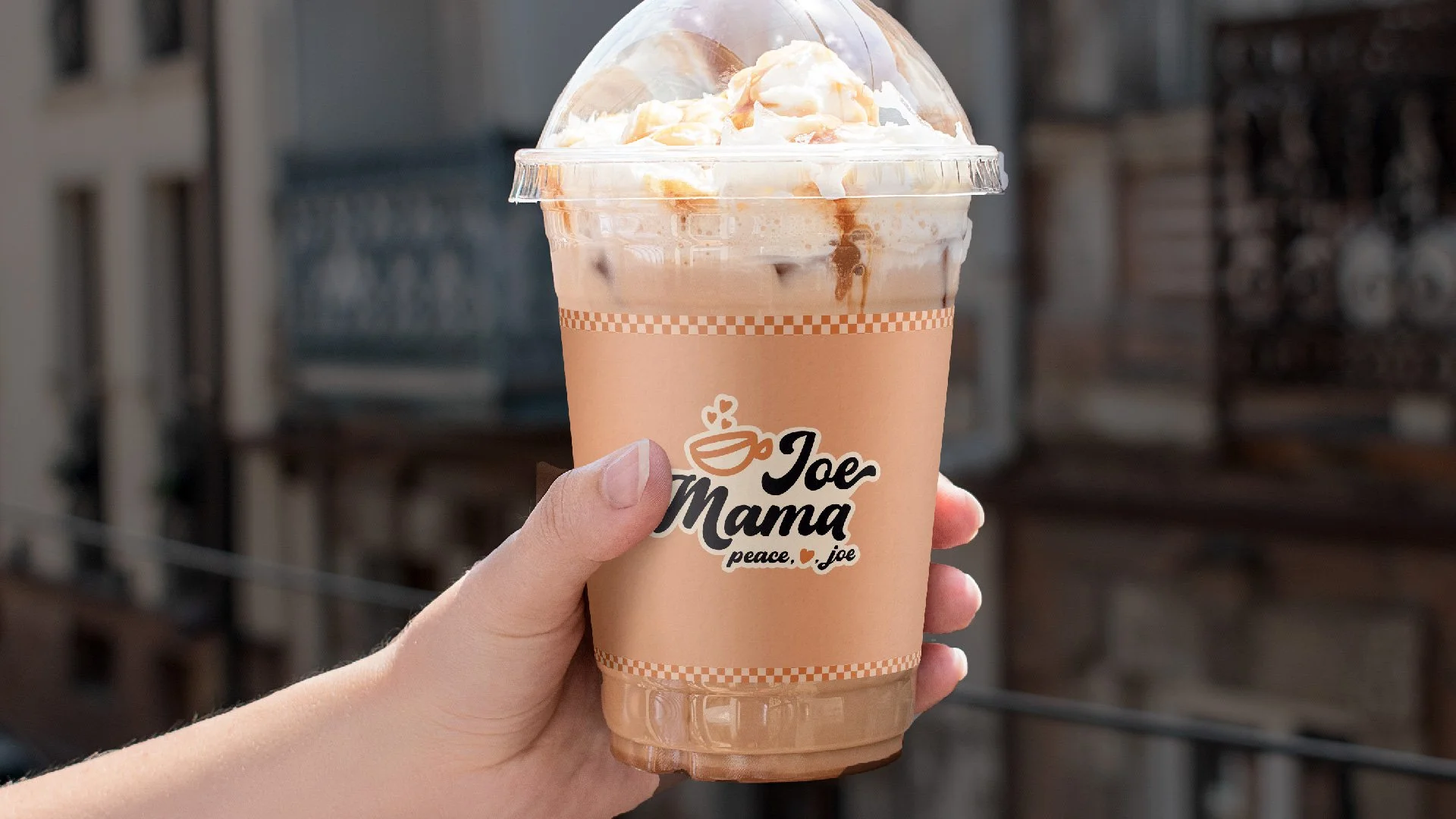
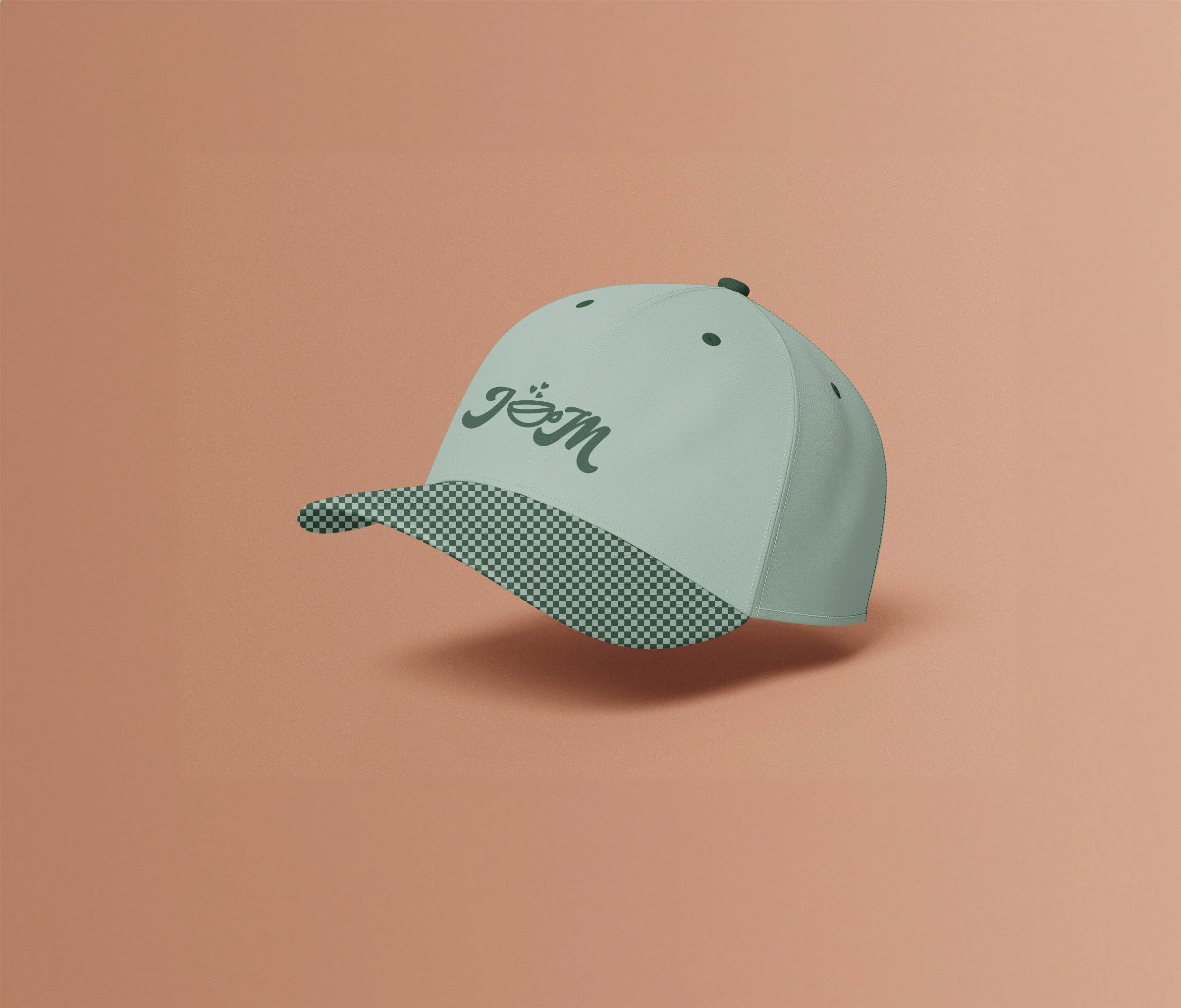
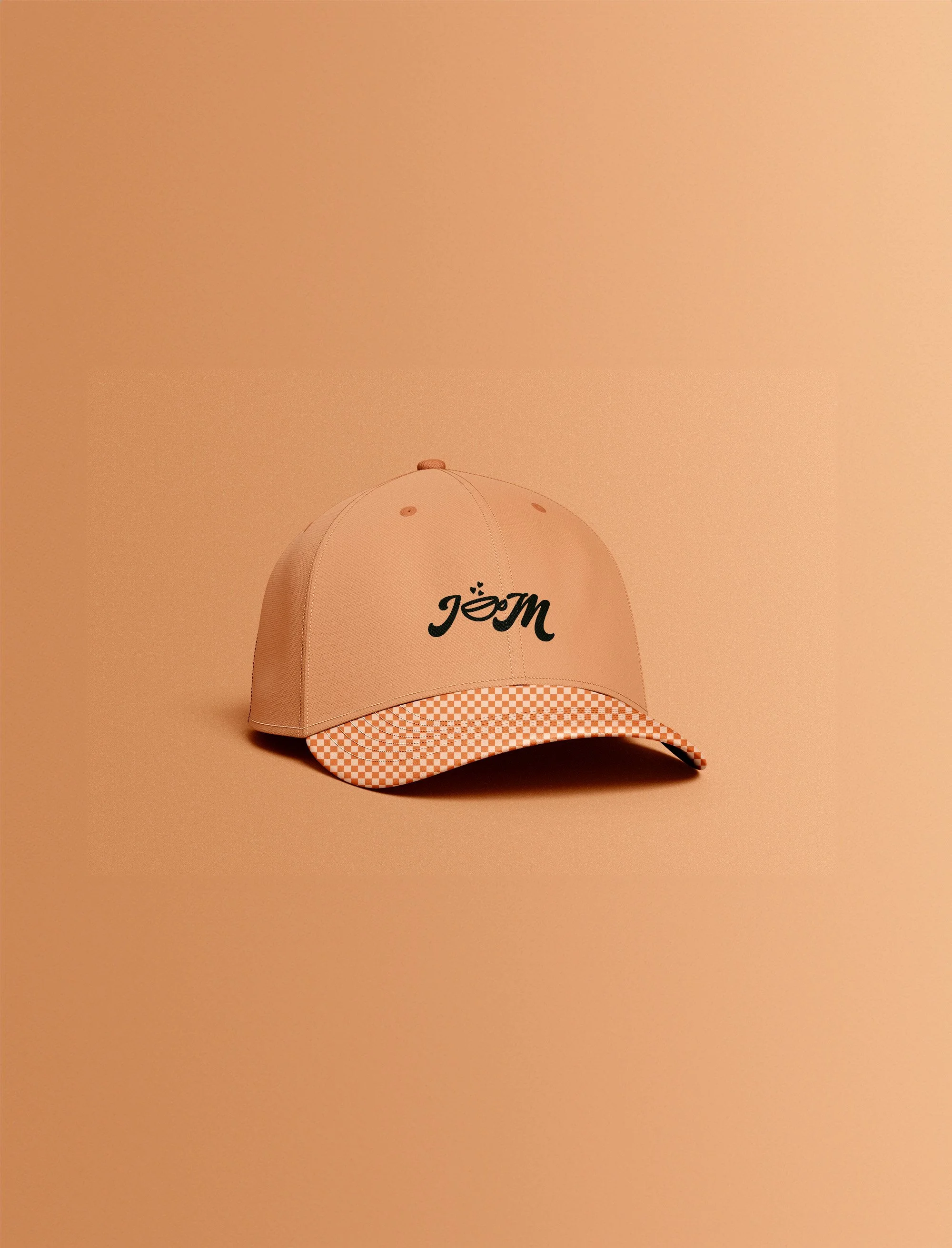
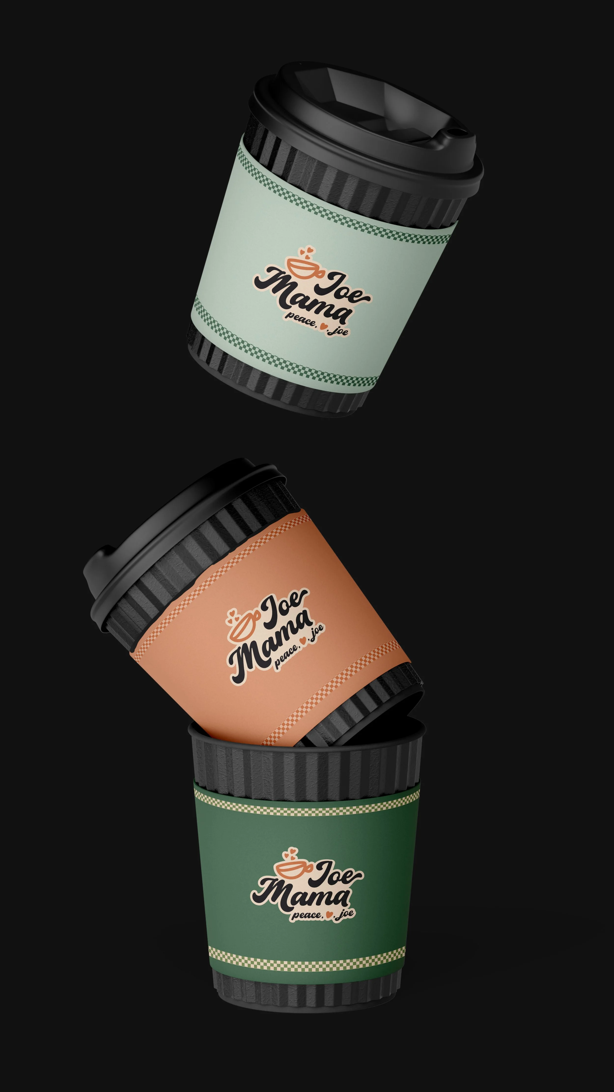
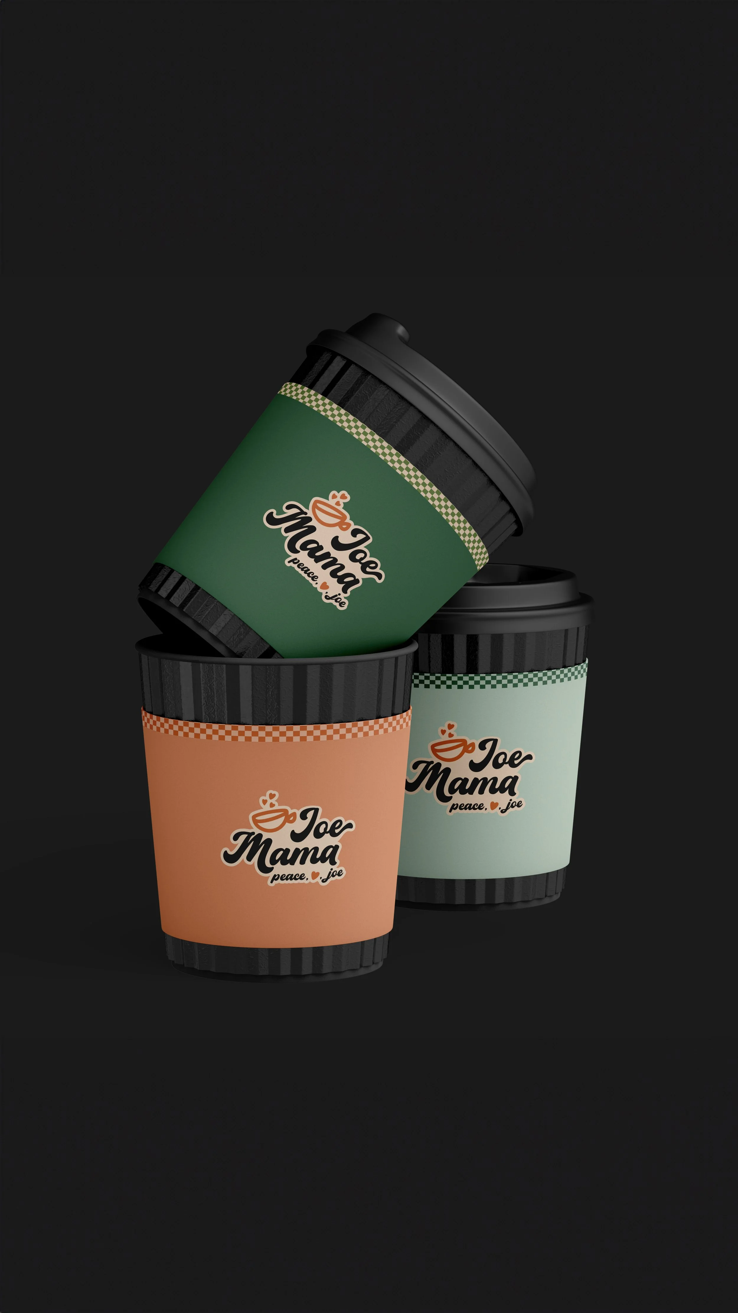
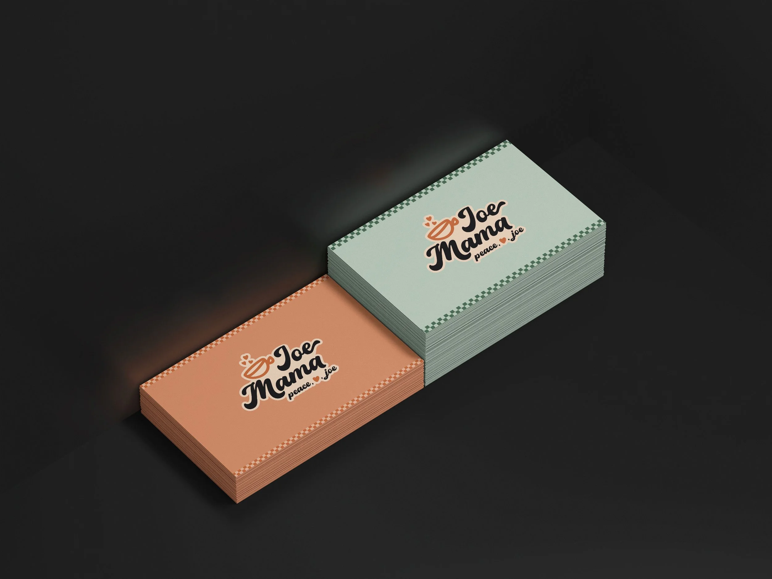
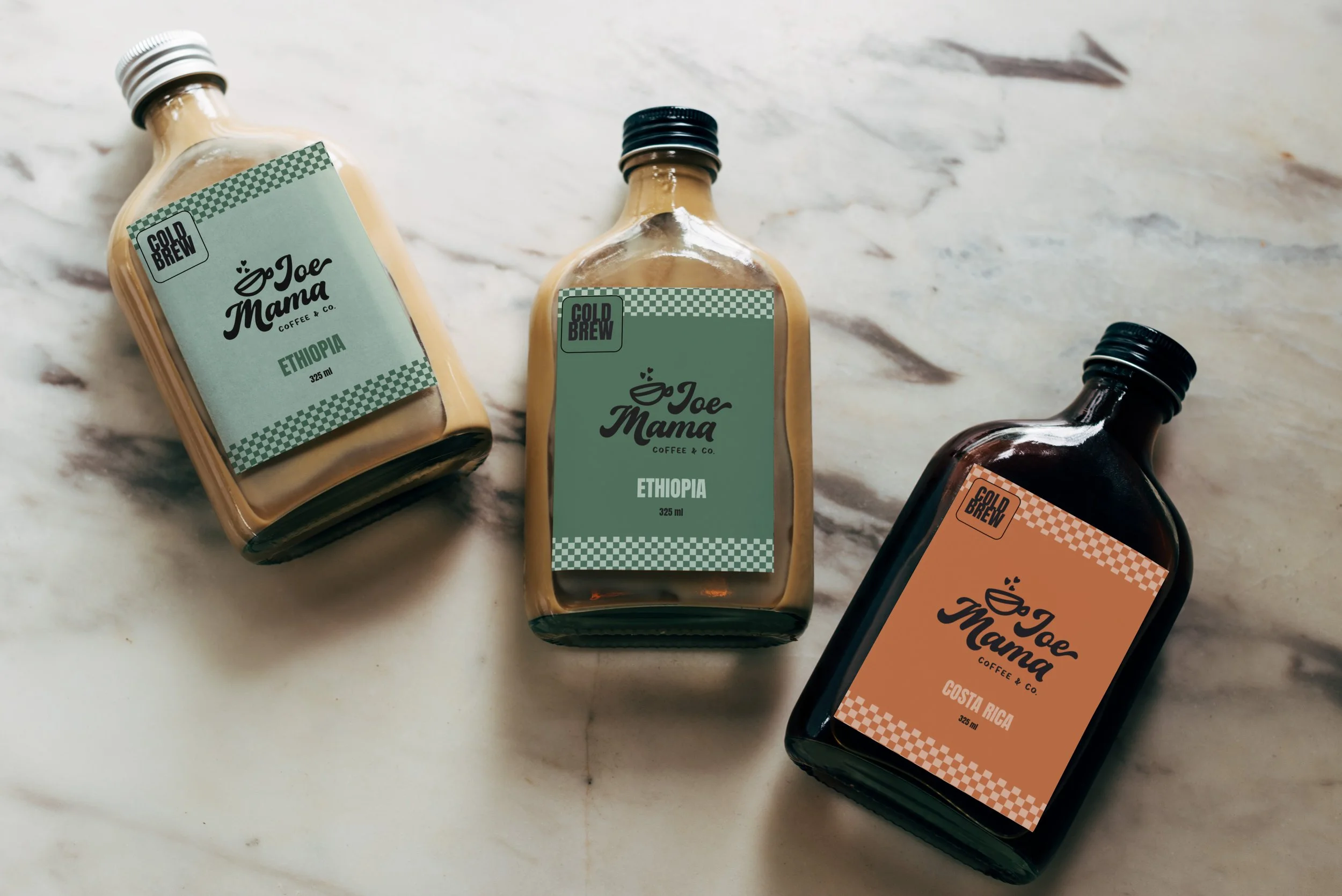
This isn't caffeine as adrenaline — it's coffee as comfort. Our whole look leans into that lived-in, sun-faded 70s warmth: hand-drawn script that curls like a hug, a peace-sign steam swirl, hearts floating up from the cup like the coffee itself is happy to see you. The checkerboard trim feels like the floor of your favorite diner — the one where they know your order before you sit down.
The palette is soft terracotta, sage, and peach — dusty, easy, unhurried. Nothing here is trying to shout. It's trying to slow you down for five minutes, hand you something warm, and remind you that the best part of the day is often the simplest one.
Joe Mama isn't chasing an image. She's the mama at the counter who's been pouring coffee for decades, who calls you "honey," who's seen it all and still greets every morning like it's a gift. Come as you are. Stay a while. Peace, love, and a really good cup of joe.

Color Palette