
"Belongs Here."
A robot that doesn't stand out — it fits in. Into your taste, your world, your home.
THE CHALLENGE
Existing domestic robot campaigns share a near-identical visual vocabulary.
Neutral, desaturated colour palettes
Sparse, undecorated spaces
Robot framed as a clean appliance, not a designed object
Implied owner: a tech-forward early adopter, not a culturally engaged luxury consumer
This is a rational choice — minimalism photographs well and signals modernity. But it has created a category blind spot. The visual language excludes an audience with both the means and the motivation to purchase: people whose homes are designed, decorated, and deliberately chosen.
SOLUTION
A visual series that treats each home as a character, not a backdrop.
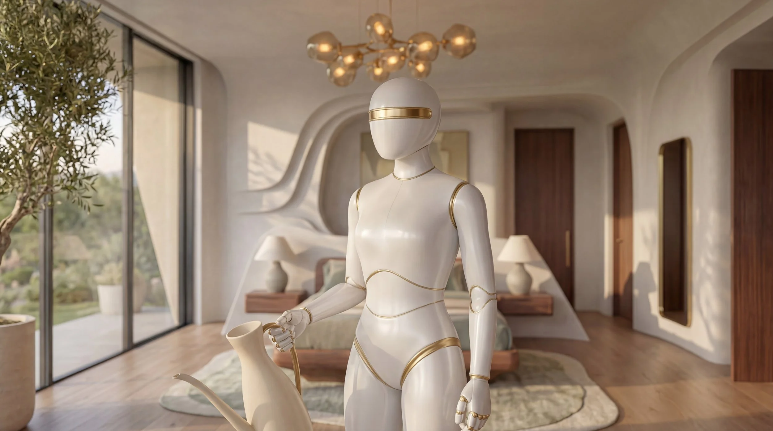
Each execution is a different home, a different owner's taste — dark jewel-toned maximalism, warm California organic, Milanese bold geometry, Tokyo wabi-sabi. The robot is the constant. Same design, same gold joint detail, same quiet competence. The home changes. The robot belongs in all of them.
THE AUDIENCE
Not a demographic. A sensibility.
WHO THEY ARE
Designers, creative directors, architects, actors, collectors. Professionals whose taste is their identity — and whose home is its primary expression.
WHAT THEY REJECT
Anything that reads as a tech product. They will not place an ugly or generic object in their living room regardless of its utility.
WHAT THEY BELIEVE
Every object in their home is chosen, not default. They do not buy what everyone buys. The robot must earn its place.
PRICE SIGNAL
These are luxury-tier products. The audience is not aspirational — they are already there. The campaign speaks to them as peers, not converts.
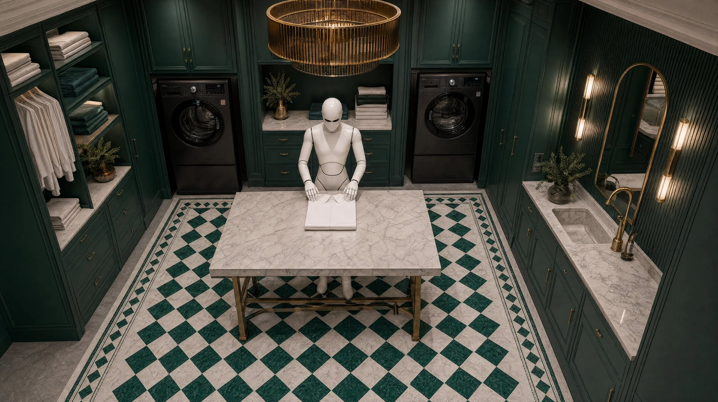
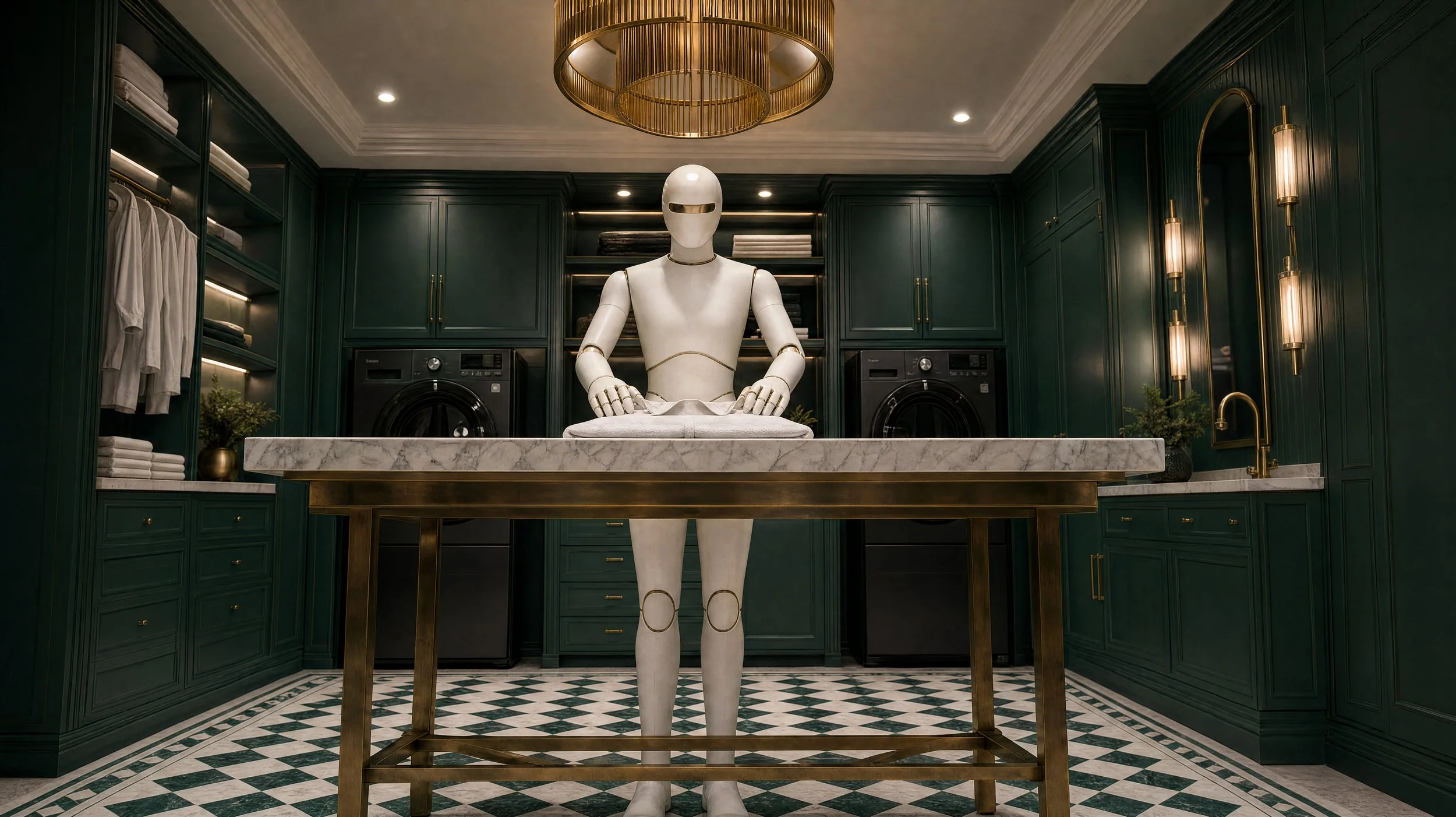
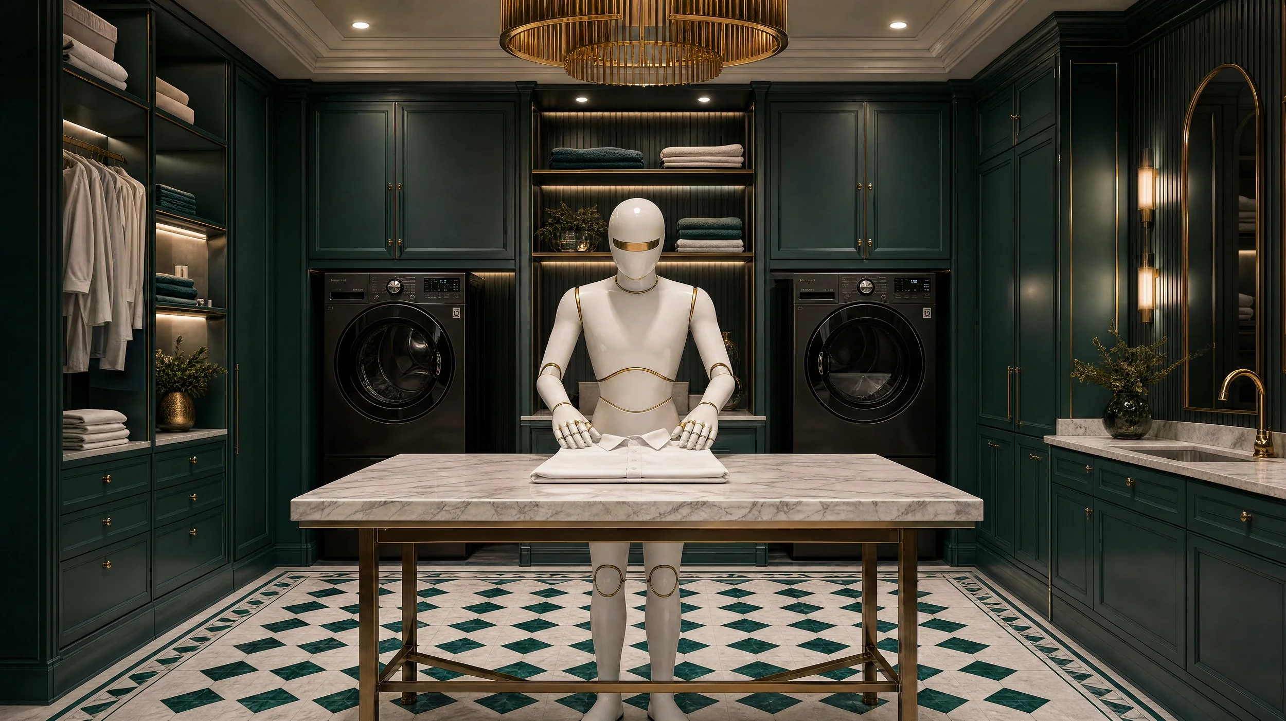
The Fold
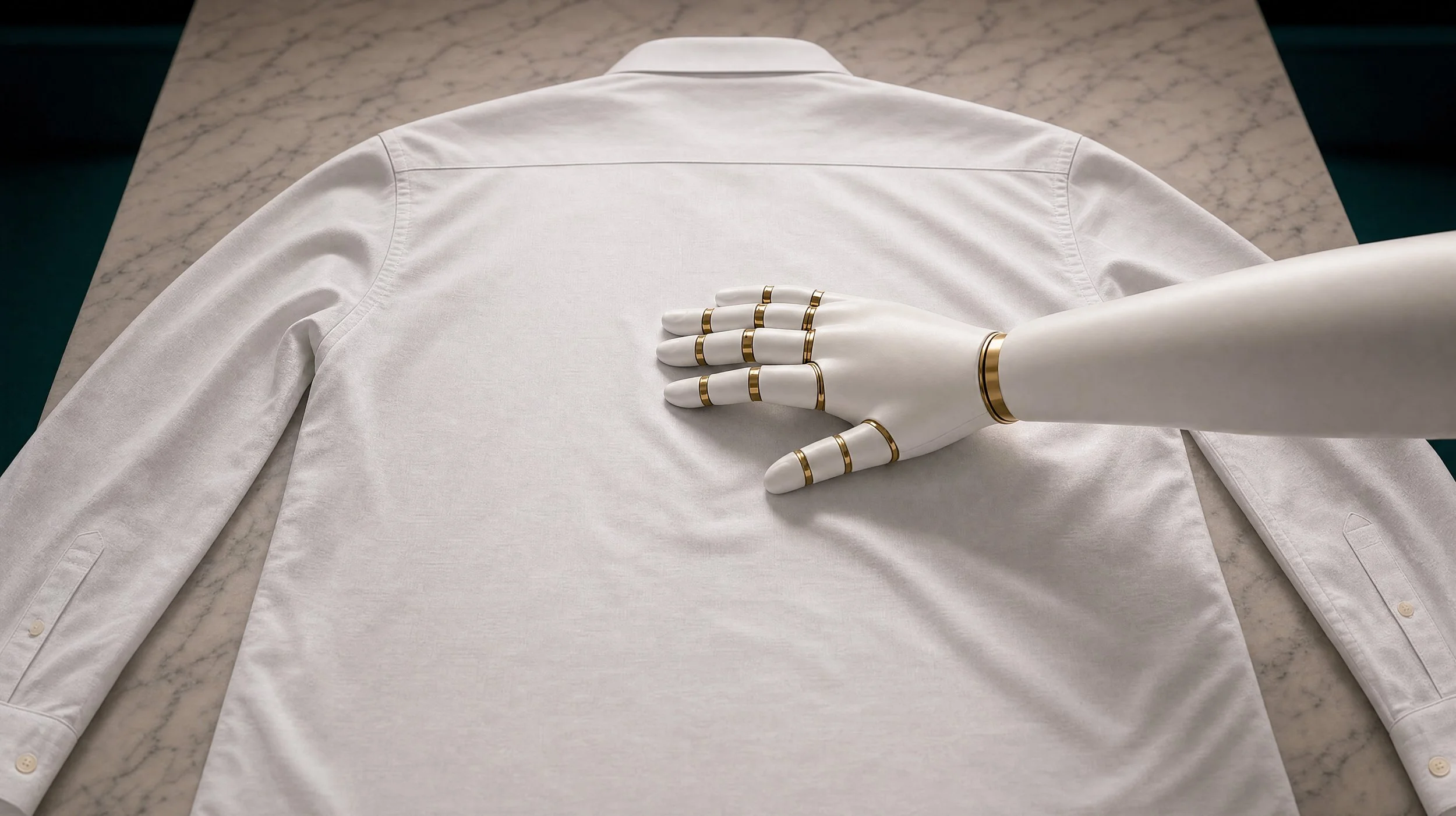
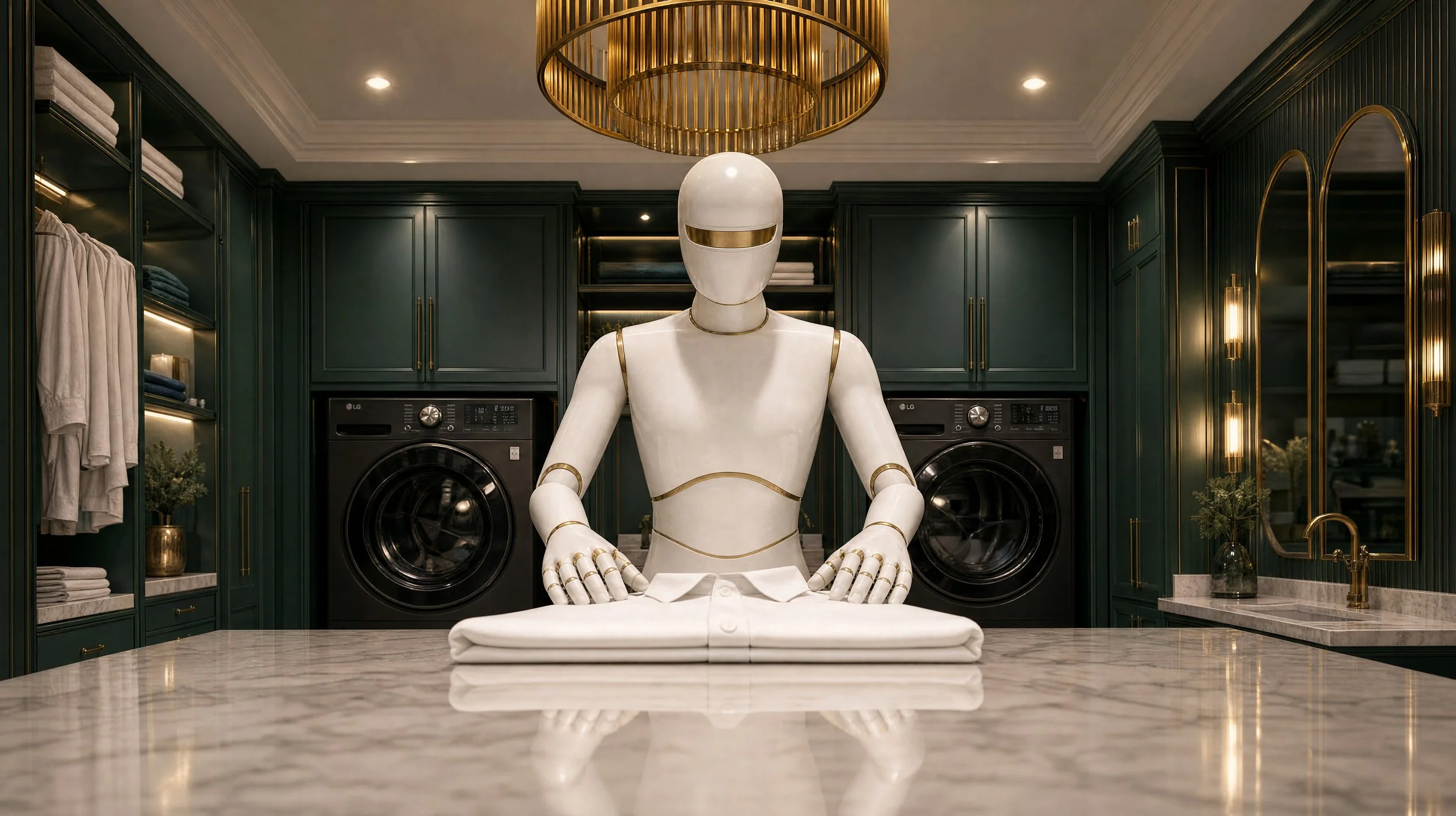
The first image sets the tone. A luxury laundry room designed in the spirit of a Gucci showroom — deep hunter green cabinetry, brass hardware, marble surfaces, geometric tiled floors. Standing at the centre is VORN, a white and gold robot, folding a crisp white shirt with quiet precision. The room is dark, rich, and deliberately chosen. The robot doesn't look out of place — it looks like it was always there.
VORN
VORN positions itself entirely on taste rather than technology. While competitors lead with specifications — battery life, AI models, processing speed — VORN leads with design. The robot is designed the way furniture is designed: to be chosen because it belongs in the room.
BRAND CHARACTER
Quiet confidence — never announces itself
Design-literate — speaks to people who know the difference between Vitsoe and IKEA
Culturally specific — references that reward the right audience
Editorial, not commercial — the campaign feels like a magazine shoot, not an advertisement
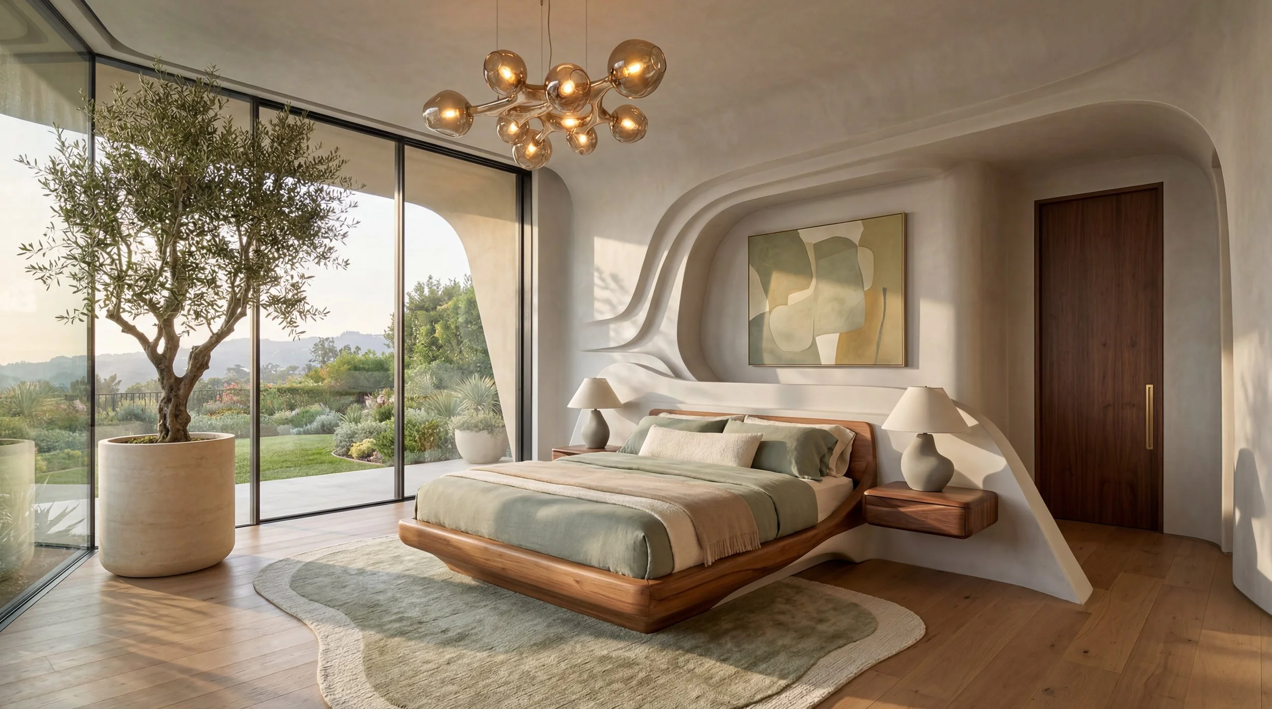
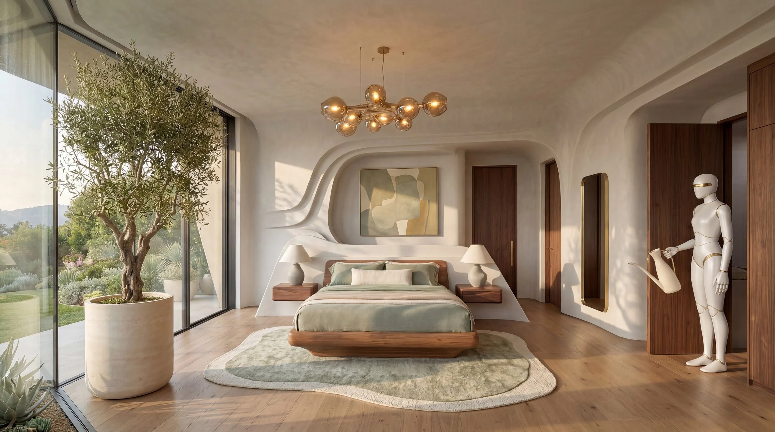
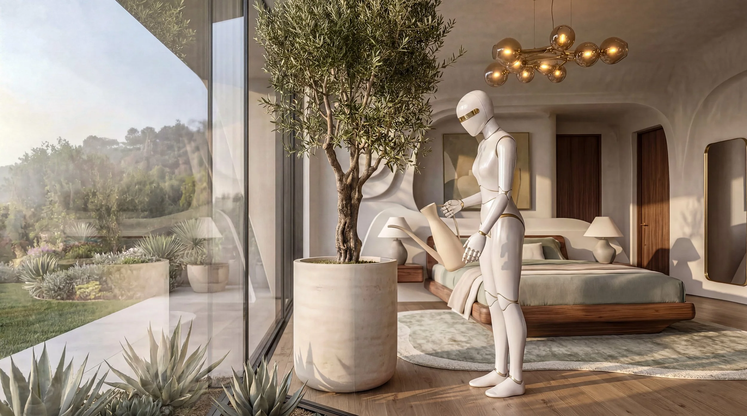
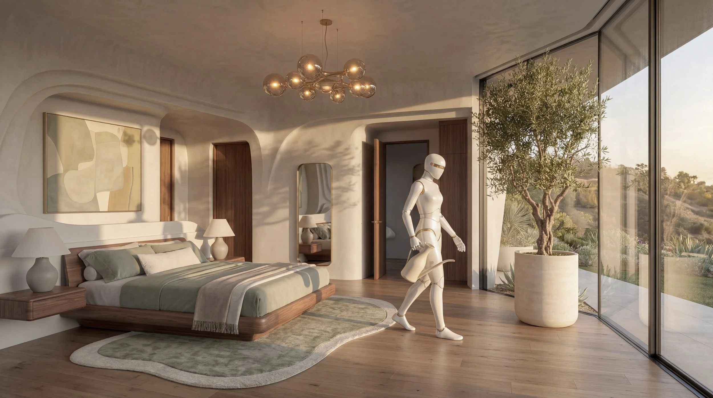
The Tend
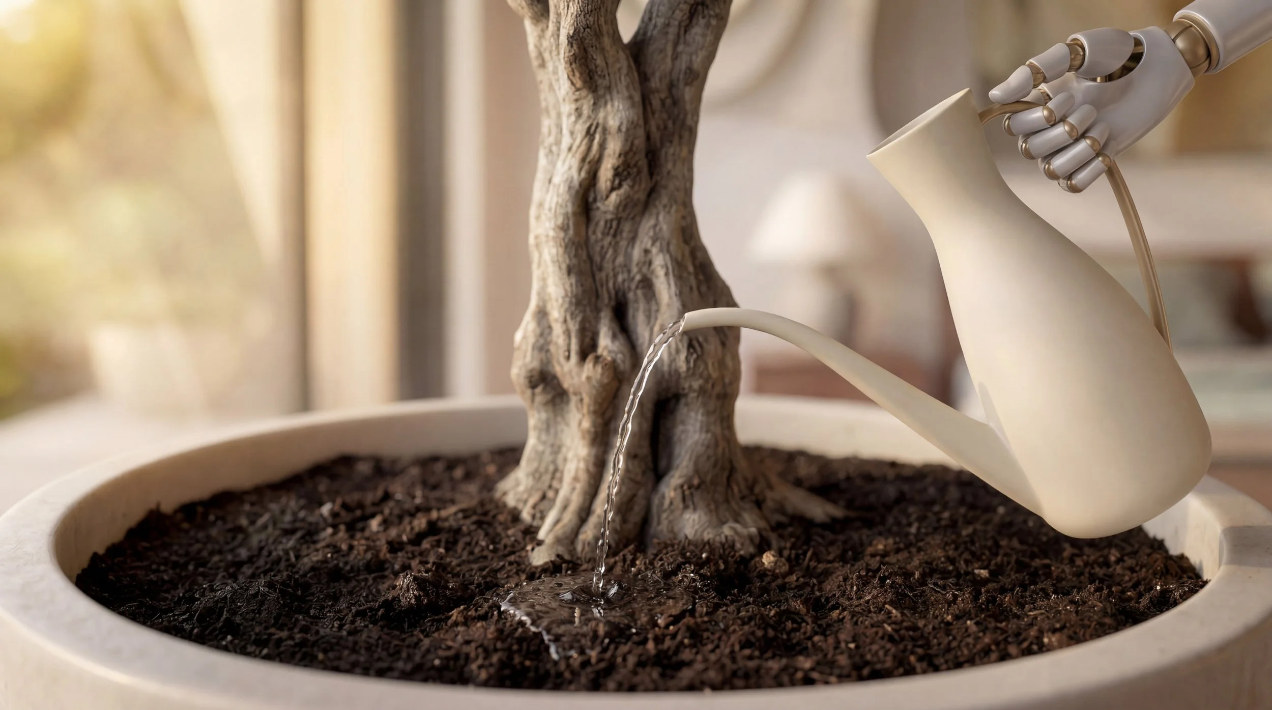
The campaign will grow into three distinct aesthetic worlds, each belonging to a different kind of home. The second world blends the fluid, curvilinear architecture of Zaha Hadid — walls that flow into floors with no hard edges — with the warm organic textures of California living: walnut, olive trees, natural light. The robot tends to a living thing in a room that is itself alive.

🔗🔗🔗🔗🔗🔗🔗🔗🔗🔗🔗🔗🔗🔗🔗🔗🔗🔗🔗🔗🔗
🔗🔗🔗🔗🔗🔗🔗🔗🔗🔗🔗🔗🔗🔗🔗🔗🔗🔗🔗🔗🔗
You can explore the Next and Previous projects below! ✨
Plus, here’s a handy link to dive into my Corporate Portfolio, Freelance Work, and Marketing Key Art Portfolio—happy browsing! 🚀🎨